← All work

Dgat fnjan

R—001 Brand identity Studio 2026 Client work

A brand identity for Dgat fnjan, a place for traditional Arabic coffee made for long conversations. The mark is two stacked finjans, a little off-balance: the moment after the pour, when nobody is in a hurry to leave.

Shown with the client's permission. The brand, its name and its artwork belong to the client.
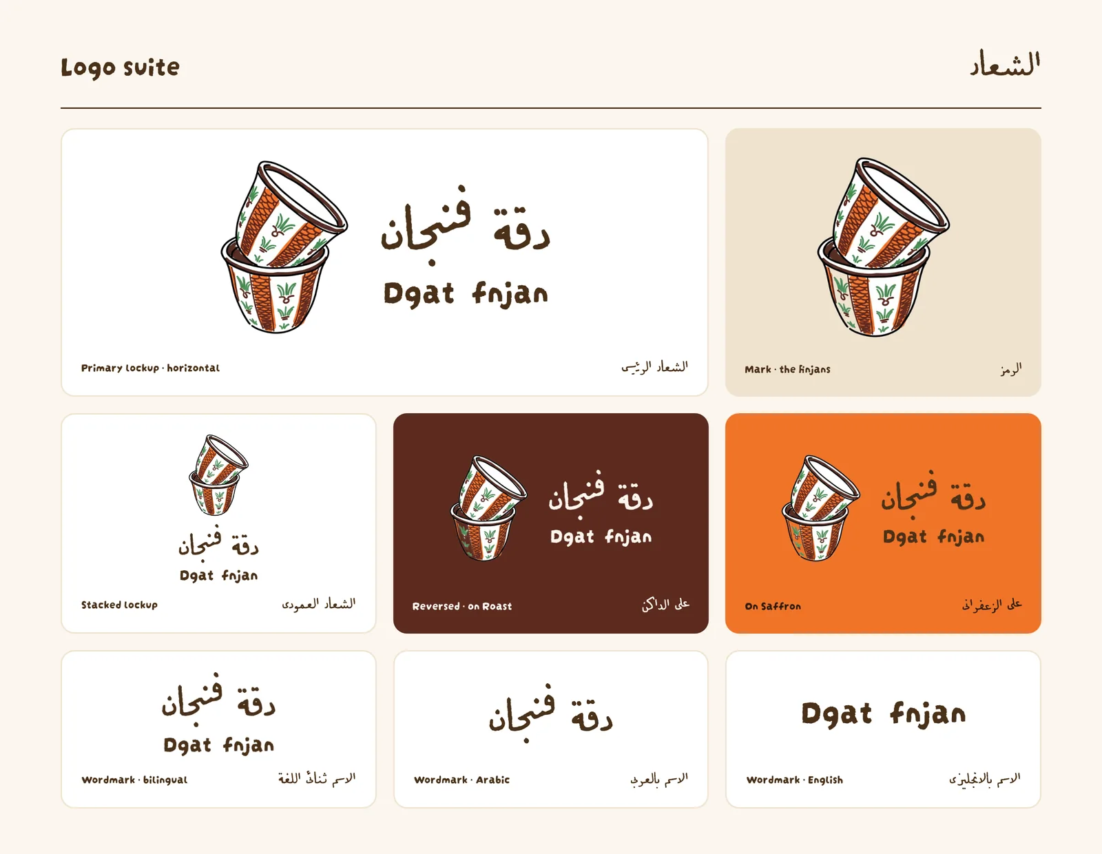
Dgat fnjan logo suite: a hand-drawn mark of two stacked finjan cups with orange and green stripes, shown with the Arabic and English wordmarks in horizontal, stacked, dark-brown and orange versions.

Logo

The finjans mark with the Arabic and English wordmarks, in horizontal and stacked lockups, reversed on Roast and placed on Saffron.
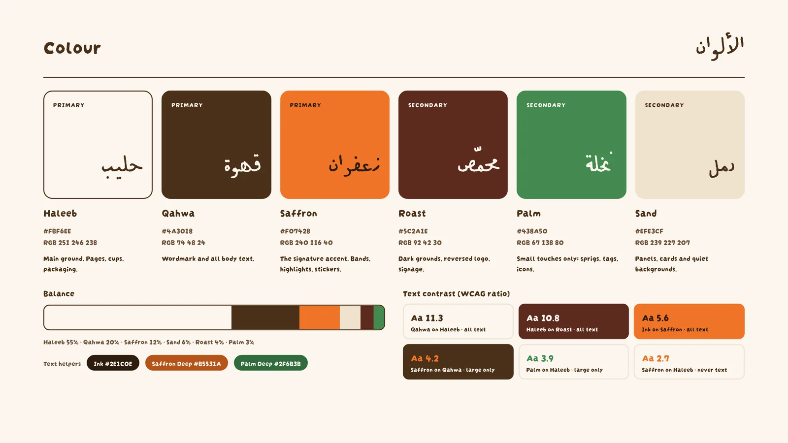
Dgat fnjan colour palette of six swatches with Arabic and English names: Haleeb cream #FBF6EE, Qahwa brown #4A3018, Saffron orange #F07428, Roast dark red-brown #5C2A1E, Palm green #438A50 and Sand beige #EFE3CF, with their balance and contrast ratios.

Colours and their meanings

Six colours named after the table: Haleeb (milk) for grounds, Qahwa (coffee) for text, Saffron as the signature accent, Roast for dark grounds, Palm for small touches and Sand for quiet panels.
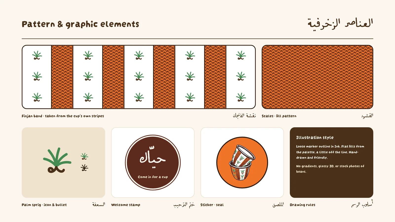
Dgat fnjan pattern sheet: a band alternating white panels of small green palm sprigs with orange scale-pattern stripes, a full scale-pattern swatch, a palm sprig icon, a round brown stamp with the Arabic word for “welcome”, and a round orange sticker with the finjans mark.

Pattern

The finjan band and the scales fill, both taken from the cup's own stripes, with the palm sprig, the welcome stamp and the seal sticker.

Want something like this?

Go to the contact page